

Client: Cardinal Sin Distillery
Project: Brand and Label Development
Roles: Creative/Art Director, Production Designer
Creative Challenge: Develop brand ID for Cardinal Sin.
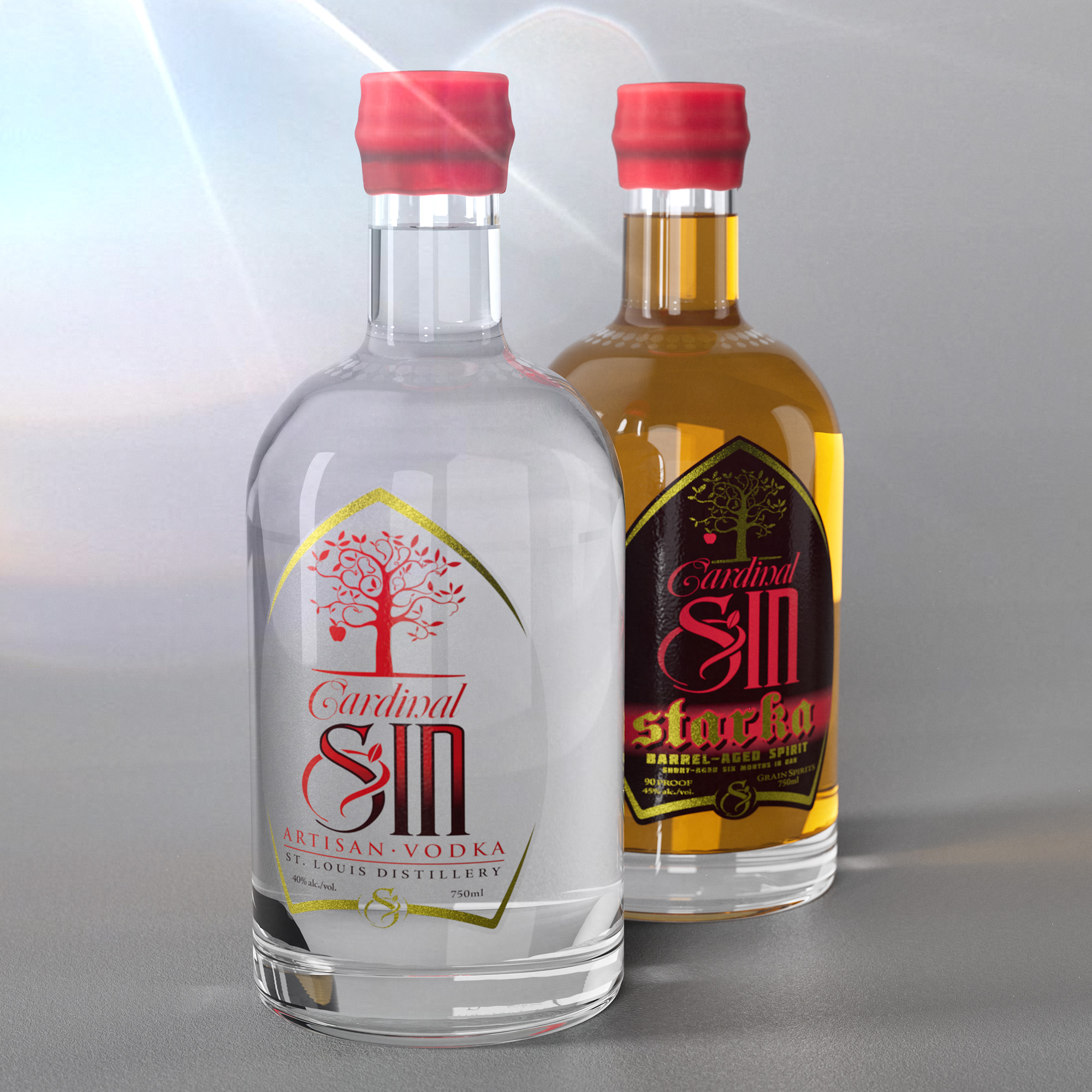
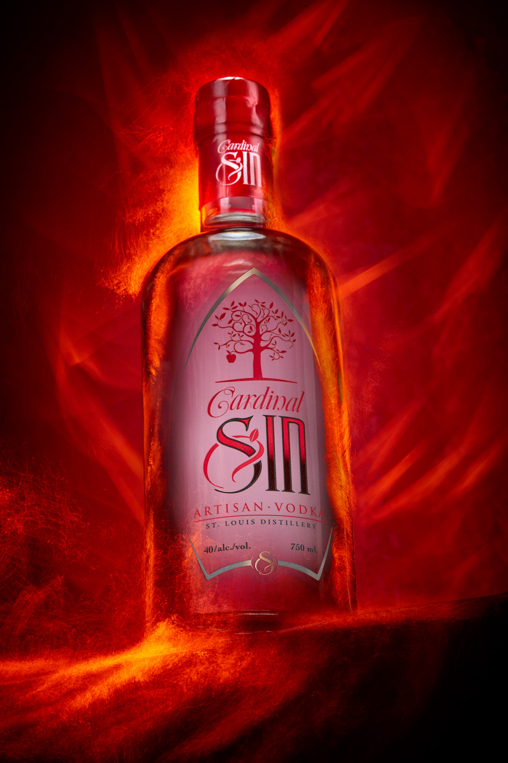
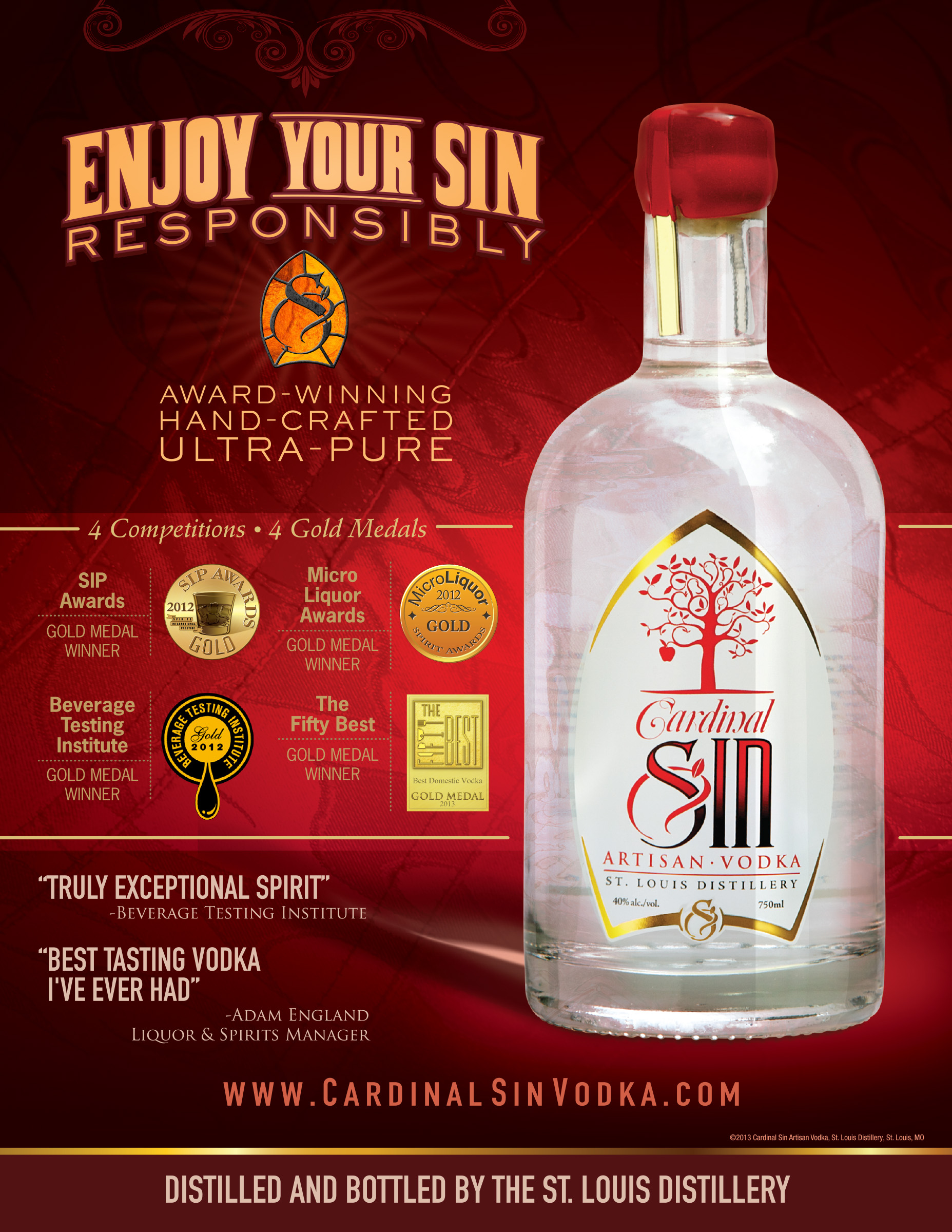
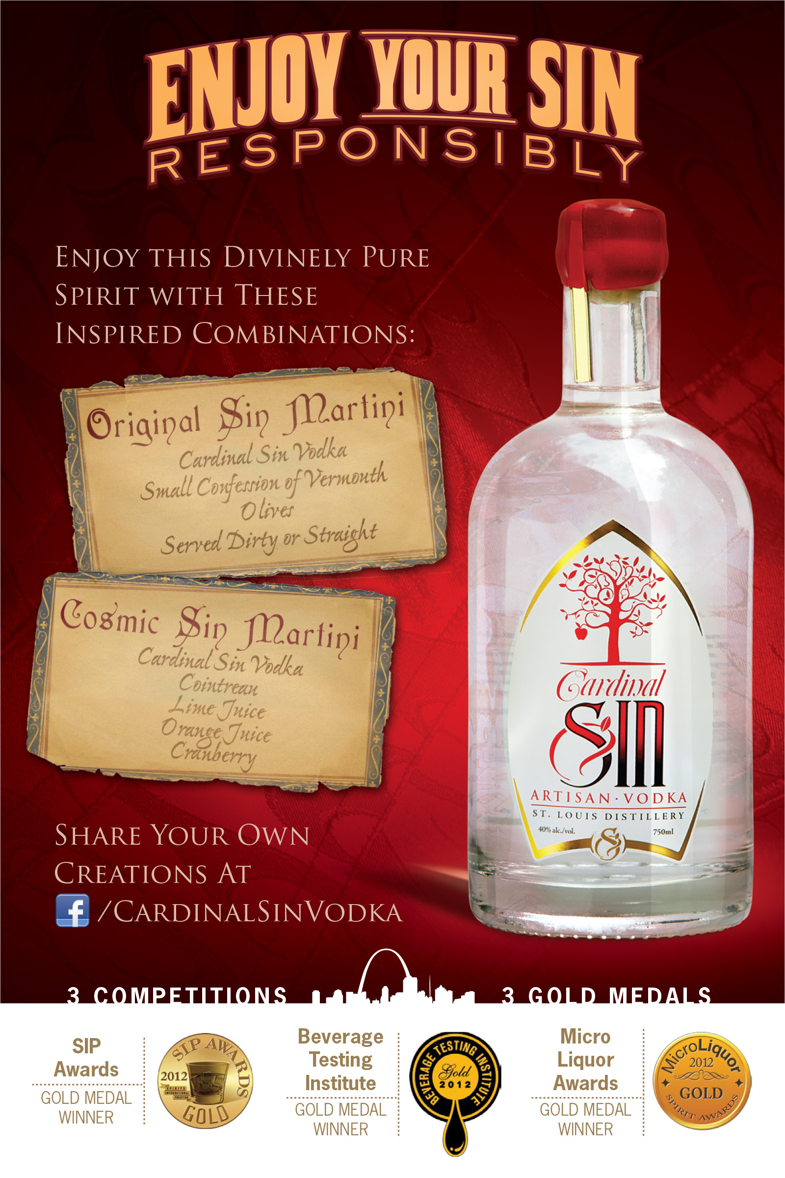
When the owners of the distillery conceived of the name “Cardinal Sin” for their flagship vodka, it was with specific intent — St. Louis is home to a large Catholic population and the implications and innuendos behind the name sold themselves.
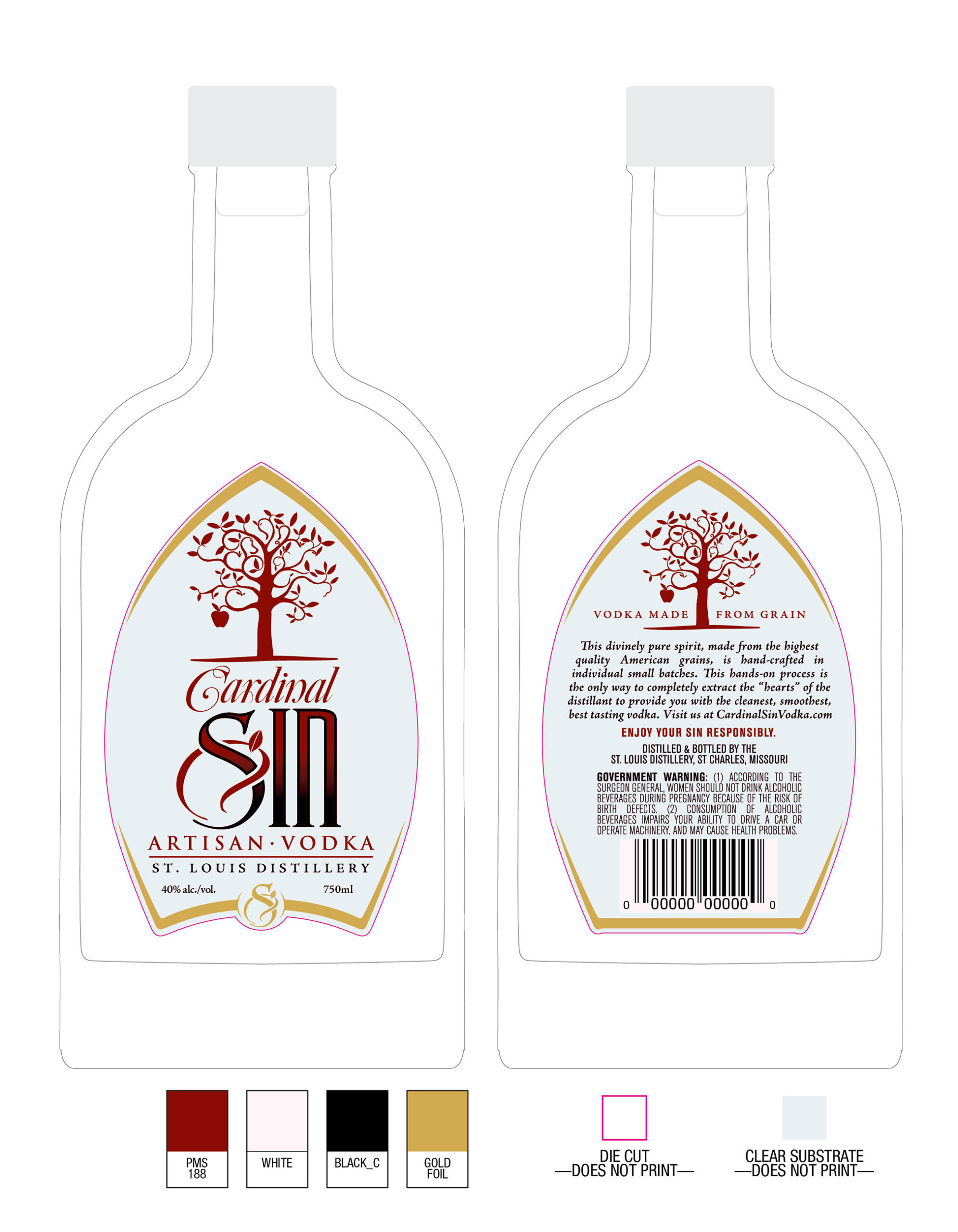
While exploring the initial concepts, I immediately zoned in on the distinct shape of the Mitre hat as the basis of the label. And with apples being an ingredient in the vodka, I dove further into religious symbolism — combining an apple and serpent’s tail — to create a distinctive, elegant flourish to the Sin.
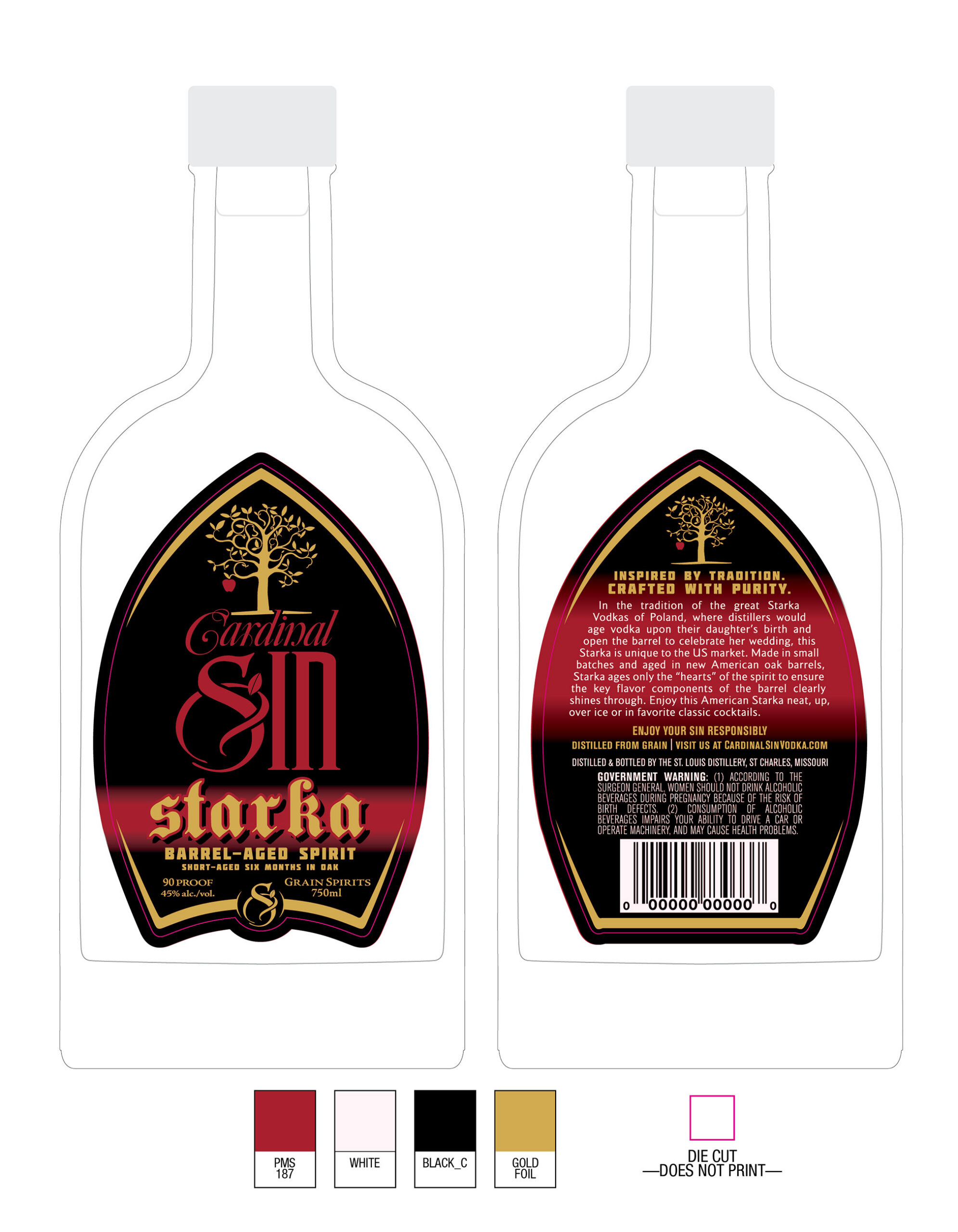
After the debut of their vodka, their followup product was Starka. With the tradition of Starka being from Poland, I focused on bold typography reminiscent of Baltic and European regions to complement the elegant, flowing calligraphy used on the vodka label.